Global Social Progress Analysis
Moving Beyond GDP to Measure Quality of Life
Back to Visualisation Overview
Project Overview
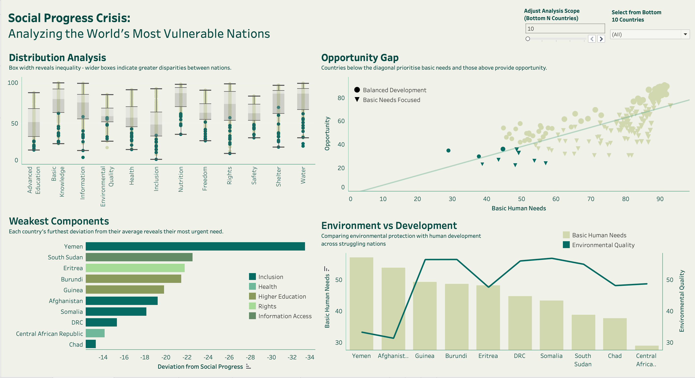
This analysis explores the Social Progress Index (SPI), evaluating 169 countries across 12 variables. The goal was to look past economic wealth (GDP) to understand how effectively nations translate resources into improved quality of life, focusing specifically on the world’s most struggling nations.
Dashboard Preview
Interactive Dashboard
Explore the global patterns directly below. Use the “Bottom N” filter to adjust the focal point of the analysis.

Analytical Strategy & Design
To ensure an unbiased and professional delivery, I implemented several specific design choices:
- Intentional Narration Arc: The dashboard moves from broad global patterns (Distribution Analysis) to specific causal issues (Weakest Components).
- Monochromatic Palette: I chose shades of green to suggest “growth potential” and avoid the judgmental “red equals bad” bias often found in development reports.
- Bottom N Parameter: Added interactivity allowing users to toggle between the bottom 10 to 30 countries to identify regional patterns.
Technical Skills Demonstrated
- Tool: Tableau.
- Visualizations: Box Plots (for spread and outliers), Scatter Plots (correlation analysis), and Dual-Axis charts.
- Calculations: \(R^{2}\) correlation analysis to confirm the link between basic needs and opportunity.
For a deep dive into the methodology and full design justifications, you can view and download the complete project report and the original Tableau workbook below.
View Full Analysis Report (PDF) Download Tableau Workbook (.twbx)